Fintech · Lending · 2016 to 2017
Payspoon
Micro-credit that builds trust for India's young earners
What I owned
- Product design strategy
- Design team leadership
- Brand identity
- UX architecture
- Stakeholder alignment
- Investor readiness
The ₹800 problem
For millions of students and young earners in India, borrowing even ₹800 for books or ₹600 for a cab was almost impossible. Rising costs and low incomes mean each generation borrows more, but while wealthier families lean on parents and relatives, the middle class has nowhere to turn without a good credit score.
And a credit score needs a credit history. Banks and lenders see students and fresh graduates as too risky, so the people who most need a first small loan are the ones who can never get one. Payspoon's founders came to us with that gap, and it turned out to be as social and emotional as it was financial.
No credit history, no credit
Research with people aged 16 to 35 showed how often they needed small amounts, and how badly existing services handled it.
A closed loop
Without past credit there is no credit score, and without a score there is no credit.
Risk-averse lenders
Banks and lending organisations saw students and new graduates as too risky for even small loans.
Painfully slow processes
Long applications and approval waits for amounts that are needed today, not next week.
Vendors waiting to be paid
Shops and service providers needed their money quickly, not weeks after a sale.
Set the design direction for a new kind of credit
As Head of Design at Cerebtech, I led creative direction across Payspoon's product, UX and marketing, and managed the design team alongside the marketing and development teams.
Worked with
- Design team
- Marketing
- Development
- Founders
- Bank and lending partners
Product design strategy
Defined how Payspoon should work and feel, from the first credit to the moment a user's limit grows.
Brand identity
Created the Spoon brand, Smart. Simple., and the visual language behind it.
UX framework and architecture
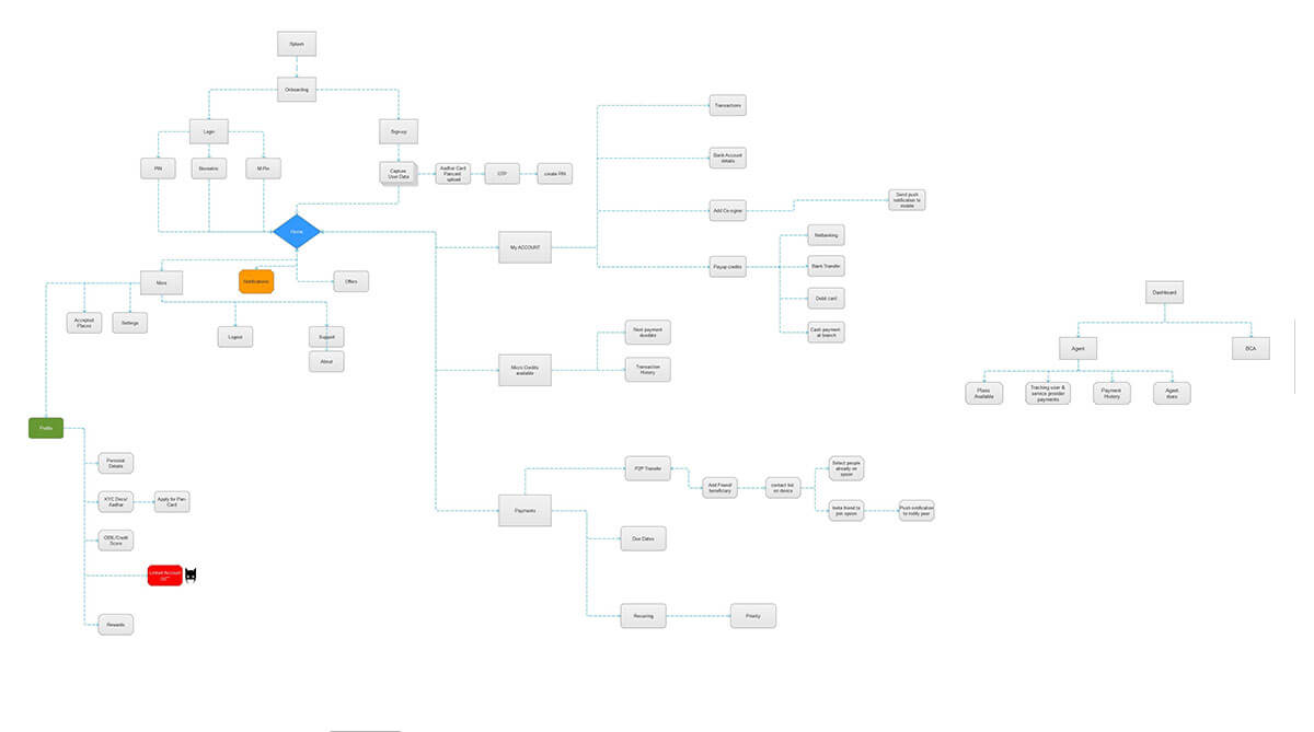
Designed the user journeys, information architecture and product structure the app was built on.
Growth and investor readiness
Supported early-stage growth and helped get the product and story ready for investors.
Design for trust, not credentials
Instead of asking who deserves credit, we asked how a person could earn it, one small step at a time. That meant understanding young people's daily lives, and the reasons banks, lenders and vendors said no.
- Research
- Field study, campus visits and user interviews
- Demographic study
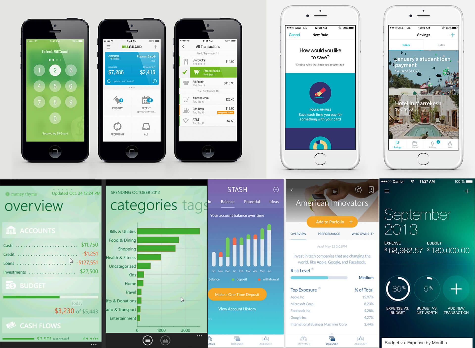
- Competitor analysis and data from other digital financial services
- Define
- User journeys and information architecture
- Stakeholder meetings with banks and financial advisors
- Design
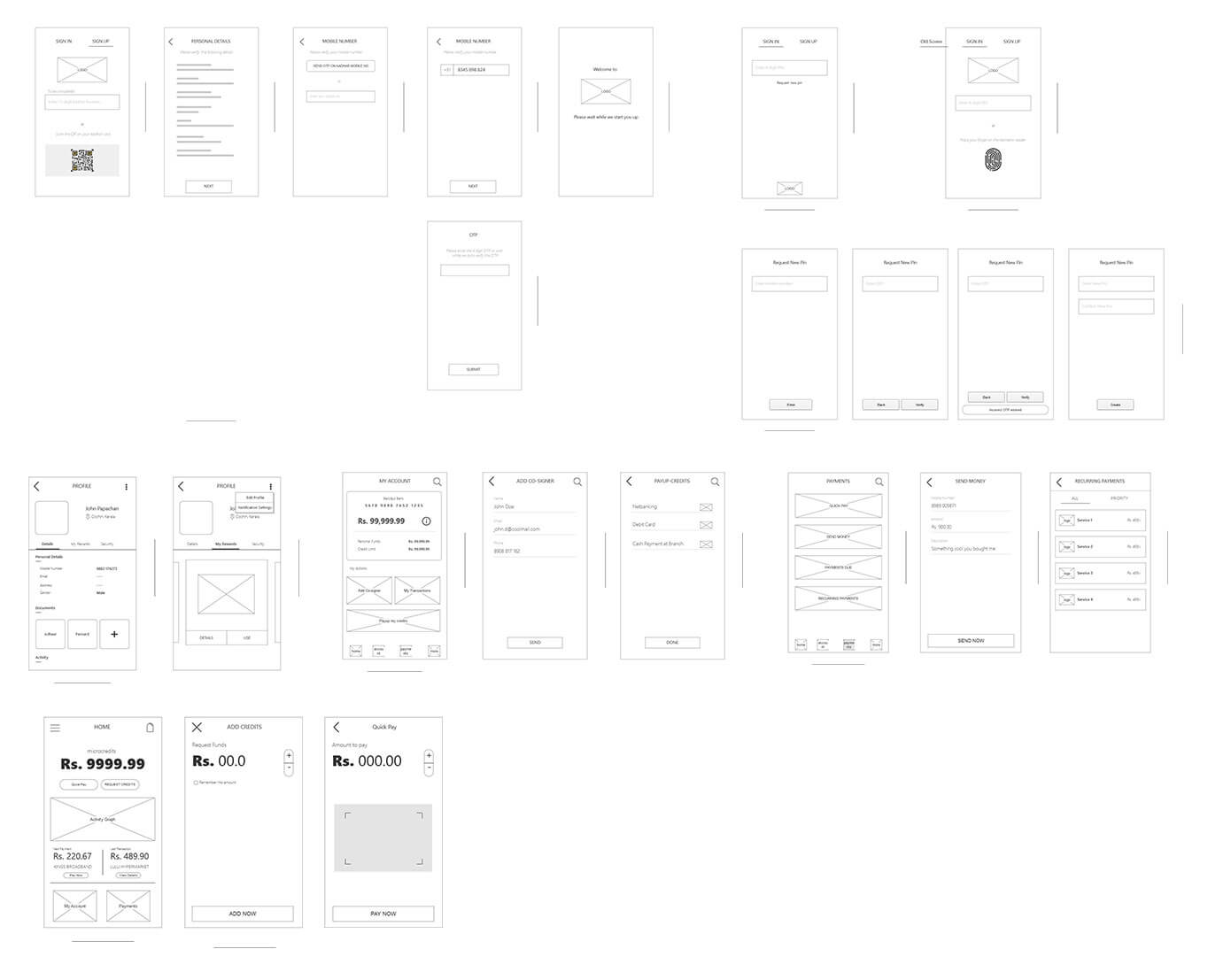
- Wireframes for onboarding, credit and payments
- Brand identity and visual language
- Emotional design through colour, type and space
- Test
- Usability testing with students from a sister training company
- Beta tests of prototypes
Calls that shaped the product
Start small, grow trust
Small credits that grow with on-time repayment, instead of asking for a credit history users couldn't have.
One-tap onboarding
Registration through India's national ID data bank kept sign-up to a few steps.
Design for dignity
Colour, type and space chosen to feel supportive rather than judgemental.
Micro-credit that grows with you
Payspoon works like a credit card, but digital, faster and with much smaller amounts, which makes credit easier to approve, manage and repay.
Start small
Micro-credits for everyday expenses, starting under ₹1,000.
Repay and grow
On-time repayment raises creditworthiness and unlocks larger amounts over time.
One-tap registration
Sign-up using India's national ID data bank (Aadhaar), with minimal steps.
Pay where you are
Instant payments with partners such as mobile networks, restaurants, cafés and bookshops.
Faster for vendors
Shorter approval times and quicker settlement, so vendors are paid in days, not weeks.
Simpler repayment
Easier repayment options agreed with banks and third-party lenders.
Smart. Simple.
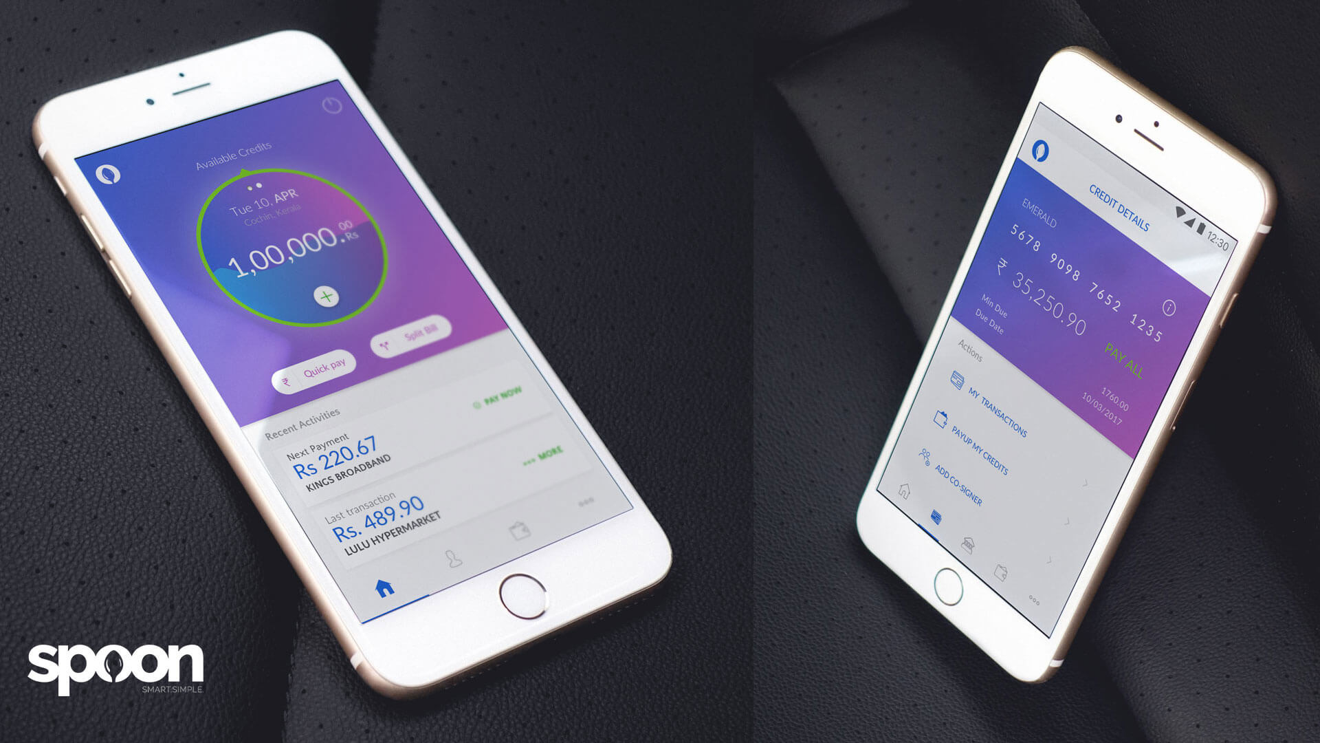
A warm, optimistic interface that never feels like a bank telling you no. Available credit sits at the centre of the home screen, quick pay and split bill are one tap away, and gentle prompts, such as applying for a PAN card, help users build a credit history.
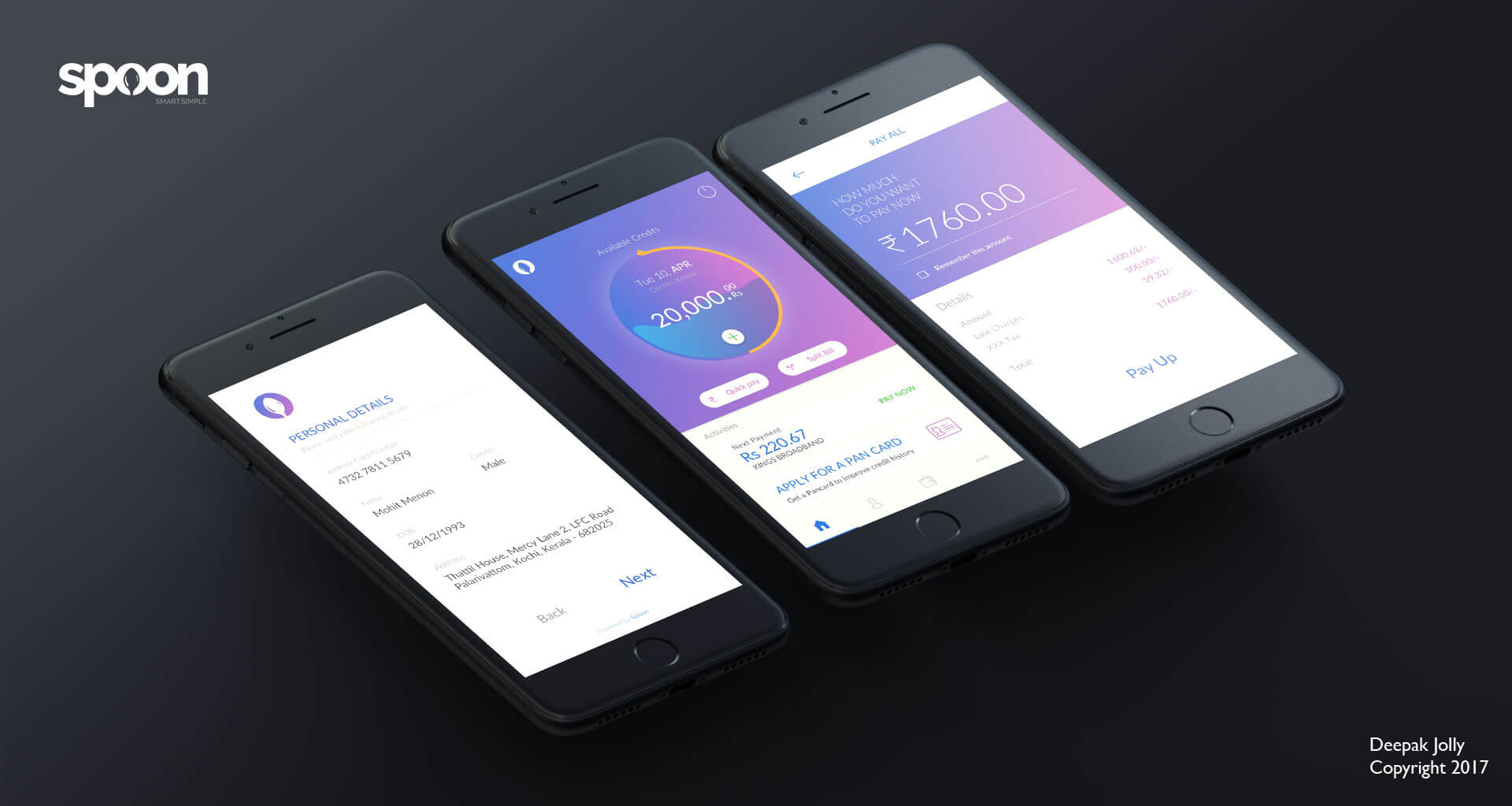
A first step, not a dead end
Payspoon launched as a micro-credit product that put dignity and ease first. Testing showed the approach worked well beyond the students we started with.
A wider audience
After beta tests of the prototypes, the user base widened from people up to 35 to people up to 50.
Growth through simplicity
Keeping the structure simple and easy to use drove user growth during the test stages.
A personal connection
Emotional touches in colour, typography and space made the app feel supportive rather than judgemental.
Ready to scale
Brand, UX framework and product architecture that supported early growth and investor readiness.
For people the financial system has overlooked, dignity is a design requirement. Small, fast and judgement-free steps built more trust than any single feature could.
Next project
Nomadic Ink →